Changelog
Follow up on the latest improvements and updates.
RSS
We have adopted a new changelog solution called Changebot.ai. Please update your bookmarks, as all future changelog entries will be managed at https://app.changebot.ai/updates/adalo.
new
Announcements
🚀 Deep Linking is now live in Adalo!
Ever wished you could teleport your users right where they need to go? 🚀 Deep Linking is now live in Adalo!
🔗
Native Deep Linking
Craft custom URL slugs and map to desired screen (e.g. adalo-internal.adalo.com/deep-linking-example/event={eventID}) that open straight in your iOS & Android builds
🌐
Linking Data
Send folks directly into your app with the Data you want them to see!
🗺️
Fallback
Links navigate to your matching screen names (case‑insensitive), and if they don’t match? Back to home base they go.
Check out the Adalo Help Docs | Deep Linking in Adalo for assistance in setting this up.
new
Components
✨ New Social Media List Component
Meet the brand‑new Social Media List component, now live in Adalo!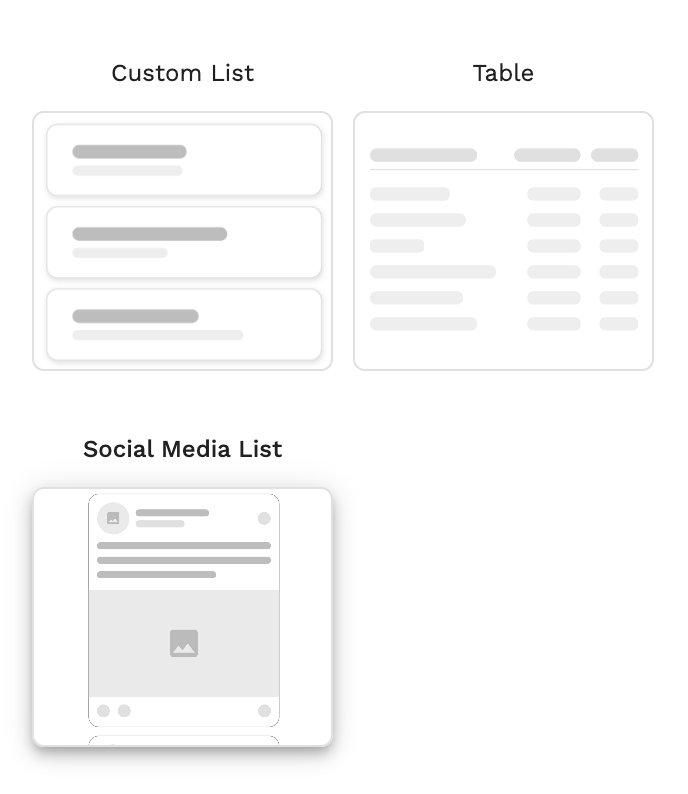
By replacing Custom Social Media Lists with the new Social Media List component, you can speed up your design workflow and boost performance in your published apps.
To see it in action and learn how to set it up, check out the Adalo Help Doc | Social Media List
Please note:
The Social Media List is only available for Responsive Built Apps.new
Performance
Adalo System Database Optimized
We are happy to announce the Adalo system database has been further optimized to improve database queries related to app builds, Magic Text, API collection endpoints, and templates.
new
The Adalo Builder
🐛 Bug Fix: iOS builds failing for some makers
The team resolved an issue causing iOS builds to fail due to a change on Apple’s end which effected out build process.
Builds should now complete successfully without further issues.
Please push a new build and reach out to our team by Submitting a Ticket if you need further assistance.
Thanks for your patience while this was being addressed!
new
Bug Fixes
🐛 Bug Fix: Images not rendering on iOS 18.3+
We resolved an issue with image visibility issues for PWA on iOS 18.3+. Please push a new build to see the fix applied to your app.
If the issue persists, please submit a support ticket and our team till look into it right away.
new
Bug Fixes
🐛 Bug Fix: SSL Certificate Not Valid
We’ve resolved an issue that caused SSL certificates to be invalid for some maker custom domains.
To apply this fix, you will need to reset your SSL in the Domain Settings. Check out this Help Doc for the steps to complete this in the builder.

new
Bug Fixes
Components
🐞Bug Fix: Actions on Table Component not working
We’ve resolved an issue that caused Actions on the Table Component—such as External Link actions and Conditional Actions—to not complete consistently.
To apply this fix, you’ll need to rebuild any non-working Actions and publish a new build of your app. Once updated, the changes will take effect.
new
Bug Fixes
Components
🐞Bug Fix: Secondary Button Action in Form Component
We've addressed an issue where the Secondary Button Action on the Form Component incorrectly triggered the Main Button Actions, especially when the main button had additional actions such as "Login" and "Link."
Please push a new build to see these changes reflected in your app.
new
The Adalo Builder
Announcements
🆕 View Installed Components in your App!
You can now view Installed Components in the and navigate to them more easily within your app! To access this feature simply select the Components Icon on the Left hand side and scroll to the bottom. There you will see "Installed in App" which will show all Components that are currently being used in your app. From there you can select the Component and see which screens they are on which will allow you to navigate directly to the screen to view or make changes.

Load More
→