new
The Adalo Builder
Announcements
🚀 Launched: A More Powerful Mobile Building Experience
Building
Mobile Apps
just got upgraded with the power of the Adalo Responsive Engine, but tailored specifically to building apps optimized for a mobile-only experience.It is the perfect app type if you don’t need to support users on different device sizes. When you’re just getting started with Adalo, this is a great way to learn as it is simpler than responsive.
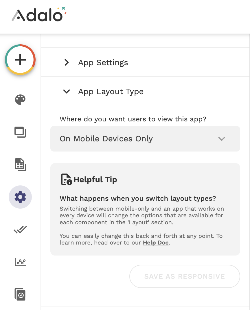
You can always switch to responsive later and even switch back to mobile at any time if you prefer it. You can publish your Mobile Only app to Apple’s App Store for iOS, Google’s Play Store, and the web on your own custom domain. On the web, all of your users will see a mobile-optimized version of your app.